Why we redesigned the candidate profile in Greenhouse

3 mins, 0 secs read time
Back in 2021, we set out to optimize the Greenhouse experience, knowing that understanding the product takes time. One of our latest initiatives focused on redesigning the candidate profile to enhance our users’ and the candidate’s experiences.
Through research and conversations with dedicated customers, we identified three main areas for improvement.
- Lack of organization and structure
- Unclear workflows and actions
- Slow and outdated technology
We aimed to support our diverse user base and address these major pain points, while also ensuring we met modern accessibility and usability standards and across various screen sizes.
Structure and navigation
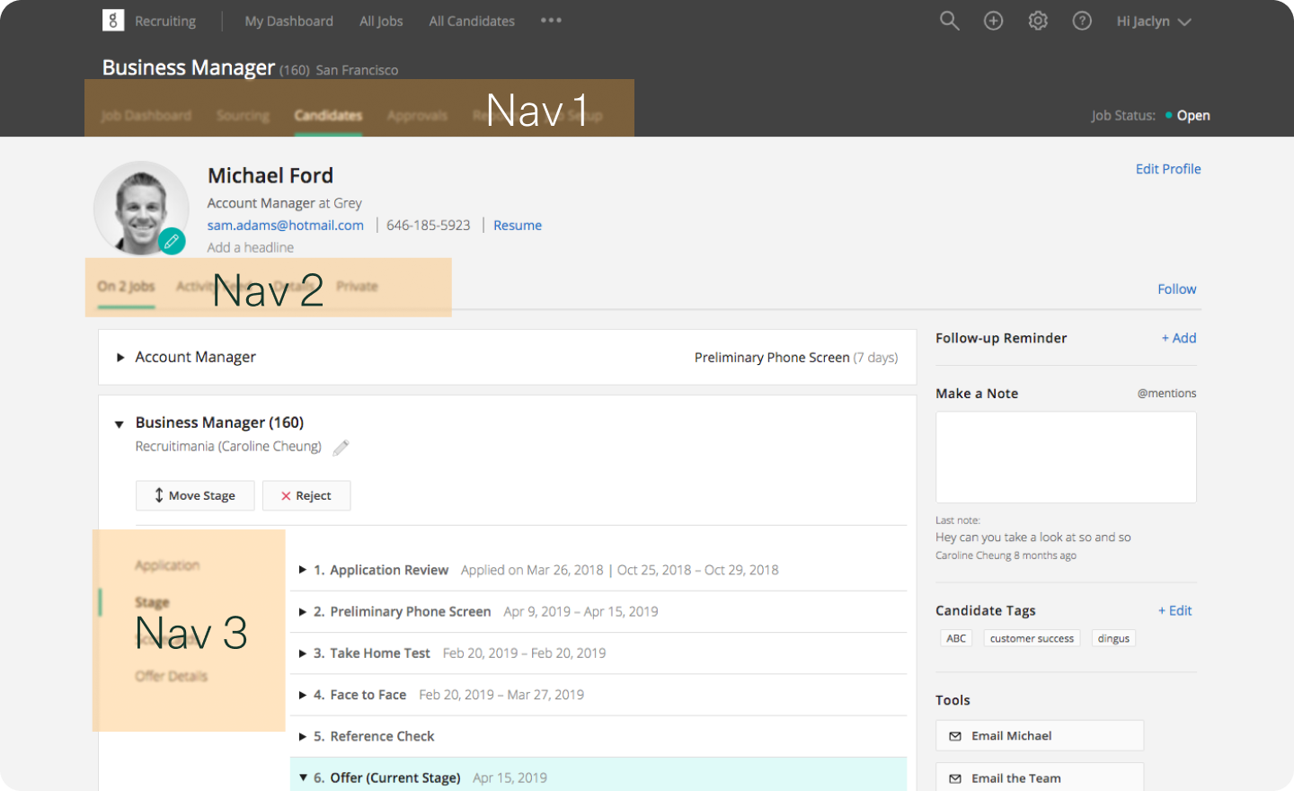
The old candidate profile’s lack of structure was a common pain point, especially for new users. We heard that there was no clear hierarchy due to the overuse of tabs and menus navigating between job, application and candidate details.

Our research revealed that even power-user Greenhouse employees struggled to find information.
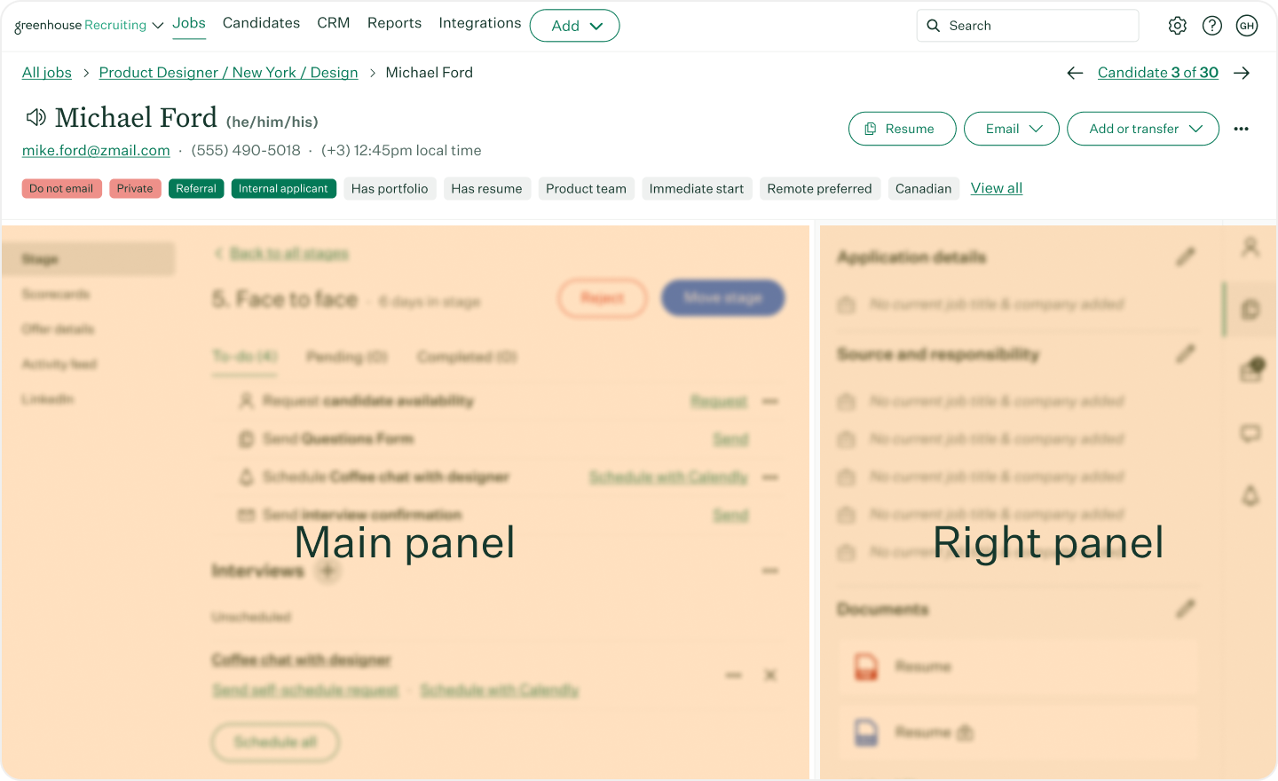
The solve? We restructured the candidate profile with a simplified left menu focusing on the candidate’s application and two distinct sections: a main panel for the primary workflows to assess a candidate for your job and a right panel for detailed candidate information.

Our goal in creating two separate work areas was to allow you to view and reference candidate information in the right panel while completing the actions that keep candidates moving forward on the left.
Guiding users to clear workflows and actions
Previously, navigating the candidate profile workflows required expertise with Greenhouse. We simplified the experience by creating implicit guidance. Depending on where candidates are in the process, relevant information and actions are progressively disclosed with additional information easily accessible.
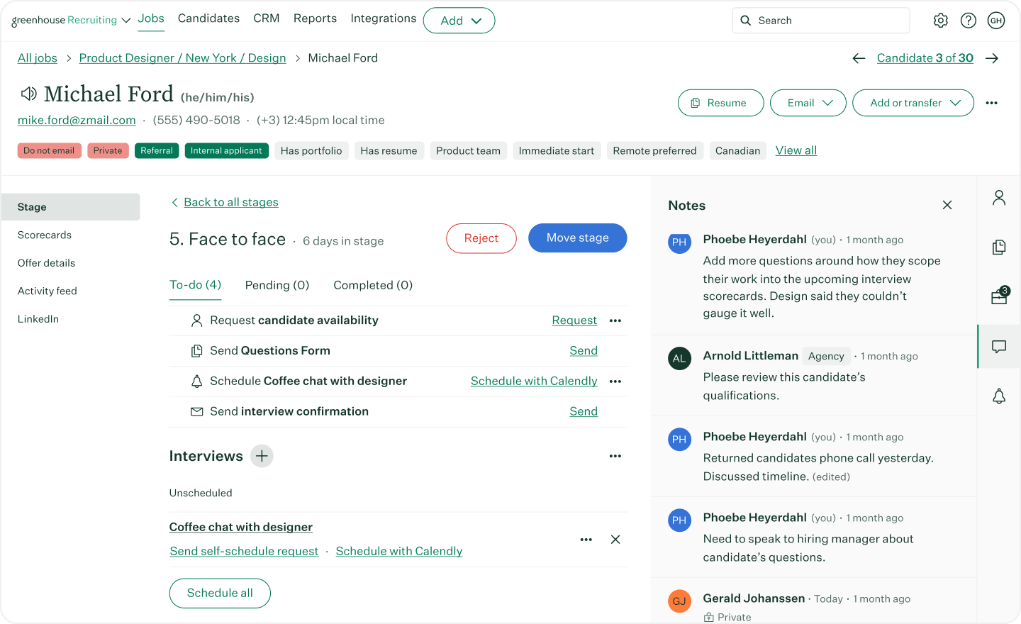
We introduced Tasks to help users quickly understand where candidates are on a stage and what actions need to be taken.
Improving communications
Collaboration is critical in complex hiring processes, requiring frequent communication between members of the talent acquisition team, hiring managers and executives. We enhanced Candidate Notes to help foster this collaboration, consolidating its functionality into a single chat-like panel. This change enables centralized conversations around a candidate directly in their profile, reducing the need for separate emails or other communication platforms.

Modern technology and scalability
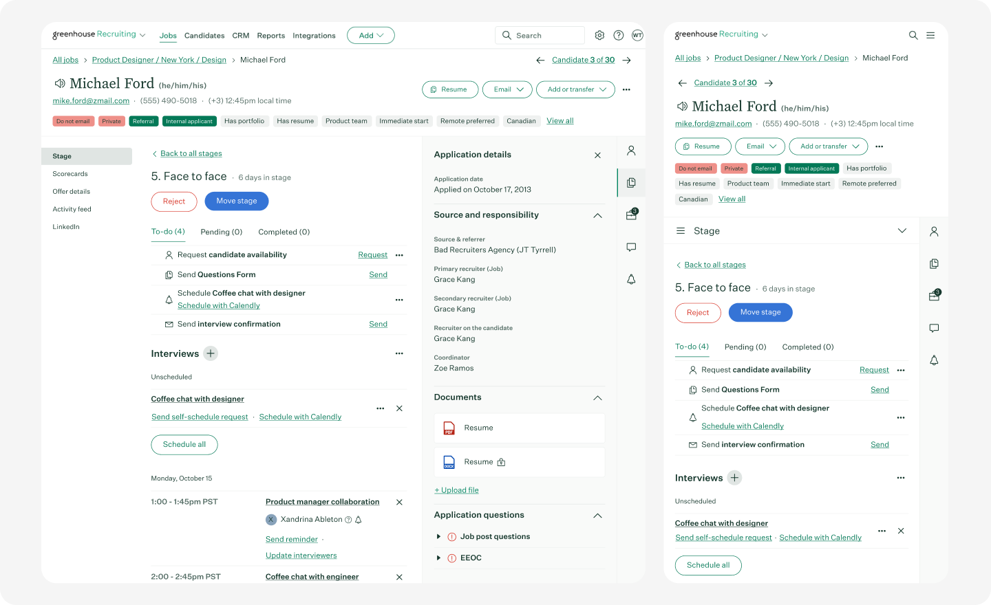
Greenhouse’s mission is to help everyone be great at hiring. Adhering to accessibility standards is an integral part of our mission. We ensured support for screen reader technology and used colors and typography that adhere to Web Content Accessibility Guidelines (WCAG) 2.1. We also designed the candidate profile to be responsive on various screen sizes, modernizing both its appearance and the technology powering it. This resulted in performance improvements leading to a faster experience with shorter load times.

Continuous improvement
As you continue to adopt the new candidate profile redesign, we understand that the work isn’t done – this is just the beginning. You can expect the candidate profile to continue to evolve and improve as we hear feedback from you. Change can be challenging, so the old experience will still be available while users acclimate, and we’ll provide clear notice before sunsetting it. Our team reads through every piece of valuable feedback we receive, so we invite you to share your honest thoughts so that we can continue to improve.
If you’re ready to elevate your hiring and simplify your process with the new candidate profile redesign, learn more from this support center article.
